
Blog 9 Digipak Research
- danliu3
- Dec 20, 2023
- 2 min read

Updated: Mar 31, 2024
What is Digipak?

Digipaks are a type of packaging used for CDs and DVDs, made from cardboard stock. It contains an internal plastic holder which can hold more than one disk. The disks in a digipak cd case are held in place by Flexi trays (trays made of plastic) glued to the cardboard cover.
The history of the digipak goes back to 1974, when Dutch electronics company Philips began developing a digital optical audio disk with an error correction code
A Digipak is a CD case , which is used to represent and promote a genre of music or an artist, and is usually seen as a 'Special Edition' CD case. The way a Digipak is folded is called a 'gatefold', meaning it is opened like a book, rather than a generic CD case.
Key components
Album name
Artist name
Album Song List
Barcode
Record label
Copyright label
Artwork
Disk Holder
Possibly some lyrics
The Velvet Underground & Nico

The album cover for The Velvet Underground & Nico is recognizable for featuring a Warhol print of a banana. Early copies of the album invited the owner to "Peel slowly and see", and peeling back the banana skin revealed a flesh-colored banana underneath.
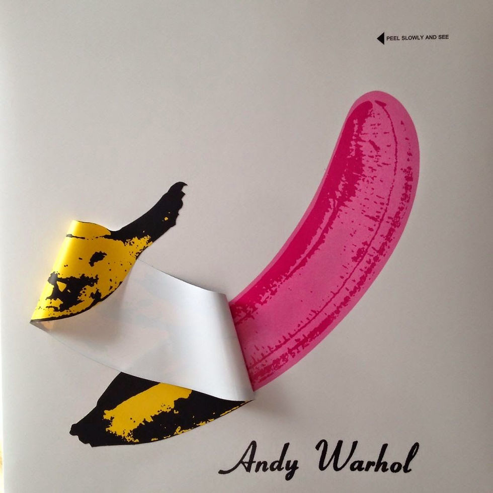
I see this as an inspiration of using graphics and iconography, and displaying the style of the artist using unique language. Conventions of high saturated colors and contrast made the design mobile and energetic. The minimalist design - a banana in the middle (stylized print) gives me the inspiration of achieving something similar. A subject with high proportion of negative space to indicate isolation and nihilism.
Led Zeppelin - Rock band


An artistic approach by adjusting the threshold and posterize the image. Music genre of rock - match with hard core, industrialized and cool. Layers of texture is applied over the ship to create a nostalgic and mysterious atmosphere. On the inside, the old man holding a lighting on a rocky hill, gives out a dark and melancholy atmosphere, plus the 'medieval font', creating a dark age impression.
BIG - American rapper


A minimalist design with simple text and unified colour palette, displaying the postmodern era taste. The use of negative space works with a single subject that highlights the only baby figure, which juxtaposes with the line 'ready to die'. This binary opposition shows the core message of rap and typical black culture.
Punk Rock


High saturated colour to amplify the rebellious core, also yellow and pink to create dynamic focal point. A mixture of san serif and serif font to highlight the revolution of new rules over the traditional perspective. On the back, the black and yellow stickers give a commercial feeling, while highlighting a casual, unserious, and cool imagery. The irregular composition of words also makes it fragmented and abstract - a postmodern approach of how to understand their central message. Key words, such as, 'Anarchy' and 'Liar' show elements of punk and anti-mainstream/power.

Our song - The Lemon Tree by fools Garden is a Baroque Pop featuring a delight rhythm with an implicit depression. Plus the political meaning I added to Yellow Cordon, it is possible that I can utilize a range of elements from classical design to a more avant grade approach, forming a juxtaposition of opinions and silent conflicts.


Comments